- Check out the cheat sheet for ggplot2: Data
Visualization with ggplot2: CHEAT SHEET
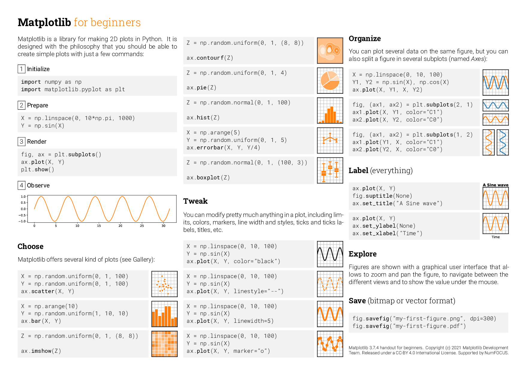
- Similarly for matplotlib: Matplotlib
for Beginners: CHEAT SHEET
- Choose one language (R or Python) to complete the exercises, but
complete the first exercise in the opposite language. Submit separate
files for each language.
- Deadline is back to one week from the original precept
date.
- Please save each plot as an image (.png or .jpg) and upload them
to your GitHub repository (4 images total).
# R
library(pak)
packages <- c("ggplot2", "cowplot", "ggthemes", "patchwork")
pak::pkg_install(packages)

lapply(packages, require, character.only = TRUE)
# Python
import matplotlib.pyplot as plt
import seaborn as sns
import pandas as pd

mpg = pd.read_csv("mpg.csv")
Exercises
Exercise 1 – Bar Plot Modification
- Task:
- Add a title to the plot: “Distribution of Cars by Class”.
- Change the x-axis label to “Type of Car”.
- Color the bars in blue.
- Rotate the x-axis labels by 45 degrees.
- Expected Output: An updated plot with the above
specifications.
Initial Plot: A simple bar plot displaying the number of cars for
each class in the mpg dataset.
# R
ggplot(data = mpg, aes(x = class)) +
  geom_bar()
# Python
sorted_mpg = mpg['class'].value_counts().sort_index()
plt.bar(sorted_mpg.index, sorted_mpg.values)
Exercise 2 – Histogram Modification
- Task:
- Add a title to the plot: “Highway Mileage Distribution”.
- Change the x-axis label to “Miles Per Gallon”.
- Fill the histogram bars with green but have a black border.
- Set the bin width to 2.
- Expected Output: An updated plot with the above
specifications.
Initial Plot: A histogram showcasing the distribution of highway
miles per gallon (hwy) from the mpg dataset.
# R
ggplot(data = mpg, aes(x = hwy)) +
  geom_histogram()
## `stat_bin()` using `bins = 30`. Pick better value with `binwidth`.
# Python
plt.hist(mpg['hwy'], bins = 30)
Exercise 3 – Scatter Plot with Facets
- Task:
- Add a title: “Engine Displacement vs. Highway MPG”.
- Change the x-axis label to “Engine Size (liters)” and y-axis label
to “Highway MPG”.
- Color the points by class and shape them by the type of drive (e.g.,
4wd, fwd, rwd).
- Add a smooth trend line (with standard error or confidence interval)
to the plot. Consider adjusting the alpha of the points for
clarity.
- Facet the plot by cyl (number of cylinders) in a 2x2 grid
format.
- Expected Output: An updated plot with the above
specifications.
Initial Plot: A scatter plot illustrating the relationship between
engine displacement (displ) and highway MPG (hwy).
# R
ggplot(data = mpg, aes(x = displ, y = hwy)) +
  geom_point()
# Python
sns.scatterplot(data = mpg, x = 'displ', y = 'hwy')
Exercise 4: Enhanced Boxplots using after_stat() and patchwork
- Modify plot1:
- Color the boxes based on median value of cty using a gradient from
light blue (low mpg) to dark blue (high mpg).
- Add a title: “City MPG by Manufacturer”.
- Rotate x-axis labels by 90 degrees and adjust their size for
readability.
- Apply a theme of your choice from the ggthemes library (R) or
.set_theme() in the Seaborn library (Python).
- Modify plot2:
- Color the boxes based on median value of hwy using a gradient from
light green (low mpg) to dark green (high mpg).
- Add a title: “Highway MPG by Manufacturer”.
- Rotate x-axis labels by 90 degrees and adjust their size for
readability.
- Apply the same theme as plot1.
- Combine the two modified plots side by side using the patchwork
library (R) or
subplots (Python).
- Expected Output: A plot with the above
specifications.
# R
plot1 <- ggplot(data = mpg, aes(x = manufacturer, y = cty)) +
  geom_boxplot()

plot2 <- ggplot(data = mpg, aes(x = manufacturer, y = hwy)) +
  geom_boxplot()
# Python
plot1 = sns.boxplot(data = mpg, x = 'manufacturer', y = 'cty')

plot2 = sns.boxplot(data = mpg, x = 'manufacturer', y = 'hwy')